NextJS | Configure styled-component to SSR
Next.js, Typescript, Styled-component
I started to use CSS IN JS some time ago and I'm definitely feel with more flexibility to manipulate styles changes due events or variables states. In this post we're going to configure a Next.js application with styled component!
Just a detail with this project. since Next.js works with Server Side Rendering and Static Site generation, we need to configure our application to process styles in server side, if not, we're going to see our page 'blinking' processing styles in client side, that's is terrible to User Experience, and to configure that is simple, so let's start!
01: Installing libraries
We're going to install the styled components library, your types and babel-plugin to process and transform code to something that the browser can understand.
yarn add styled-components
yarn add @types/styled-components babel-plugin-styled-components -D
02: Configure babel
Create a babel configuration file in root directory (babel.config.js)
module.exports = {
  presets: ['next/babel'],
  plugins: [["styled-components", { "ssr": true }]]
}
03: Creating Global Styles
We can configure our application to use Global styles in a easy way, Is a good practice to use this file to define default colors, spacings, define font and font size default and reset default styles.
To do that, create a file in src/styles/global.ts:
import { createGlobalStyle } from 'styled-components';

export const GlobalStyle = createGlobalStyle`
:root {
	--gray-900: #181b23;
  --gray-50: #eeeef2;
	--blue-200: #896ef4;
	--blue-100: #66cbff;
	--blue-50: #00ffff;
}
* {
    margin: 0;
    padding: 0;
    box-sizing: border-box;
  }

  html {
    @media(max-width: 1080px) {
      font-size: 93.75%;
    }

    @media(max-width: 720px) {
      font-size: 87.5%;
    }
  }

  body {
    background: var(--gray-900);
    color: var(--gray-50);
    -webkit-font-smoothing: antialiased;
  }

  body, input, textarea, button {
    font-family: 'Roboto', sans-serif;
  }

  h1, h2, h3, h4, h5, h6, strong {
    font-weight: 700;
  }

  a {
    text-decoration: none;
    color: inherit;
  }

  ul {
    list-style-type: none;
  }
`;
Now, just import this styles in _app.tsx, easy right?
import { AppProps } from 'next/app';

import { GlobalStyle } from '../styles/global';

function MyApp({ Component, pageProps }: AppProps) {
  return (
    <>
      <Component {...pageProps} />
      <GlobalStyle />
    </>
  )
}

export default MyApp
04: Configuring to process styles in server side
Create a file src/pages/_document.tsx and add the code bellow, in this code, we're config styles to process in server side and add 'Roboto' font.
import Document, { DocumentContext, Head, Html, Main, NextScript } from 'next/document';
import { ServerStyleSheet } from 'styled-components'

export default class MyDocument extends Document {
  static async getInitialProps(ctx: DocumentContext) {
    const sheet = new ServerStyleSheet()
    const originalRenderPage = ctx.renderPage

    try {
      ctx.renderPage = () =>
        originalRenderPage({
          enhanceApp: (App) => (props) =>
            sheet.collectStyles(<App {...props} />)
        })

      const initialProps = await Document.getInitialProps(ctx)
      return {
        ...initialProps,
        styles: (
          <>
            {initialProps.styles}
            {sheet.getStyleElement()}
          </>
        )
      }
    } finally {
      sheet.seal()
    }
  }

  render() {
    return (
      <Html>
        <Head>
          <link rel="preconnect" href="https://fonts.googleapis.com" />
          <link href="https://fonts.googleapis.com/css2?family=Roboto:wght@100;300;400;500;700;900&display=swap" rel="stylesheet" />
        </Head>
        <body>
          <Main />
          <NextScript />
        </body>
      </Html>
    )
  }
}
Now, we're conclude all configuration and we're able to use styled component in our project, so, let's do some simple example.
05: Example - Creating <Header /> component and use styled component
Inside de folder src/components/Header, lets create 2 files, index.tsx and styes.ts
// components/Header/styles.ts
import styled from 'styled-components';

export const Container = styled.div`
  height: 4rem;
  display: flex;
  align-items: center;
  max-width: 1200px;
  margin: 0 auto;
`;

export const Content = styled.div`
  ul {
    display: flex;
    li {
      transition: color 0.2s;
      &:hover {
        color: var(--blue-100);
      }
      & + li {
        margin-left: 1rem;
      }
    }
  }
`;
// components/Header/index.tsx
import * as S from './styles';
export const Header = () => {
return (
<S.Container>
<S.Content>
<ul>
<li>Home</li>
<li>About</li>
</ul>
</S.Content>
</S.Container>
)
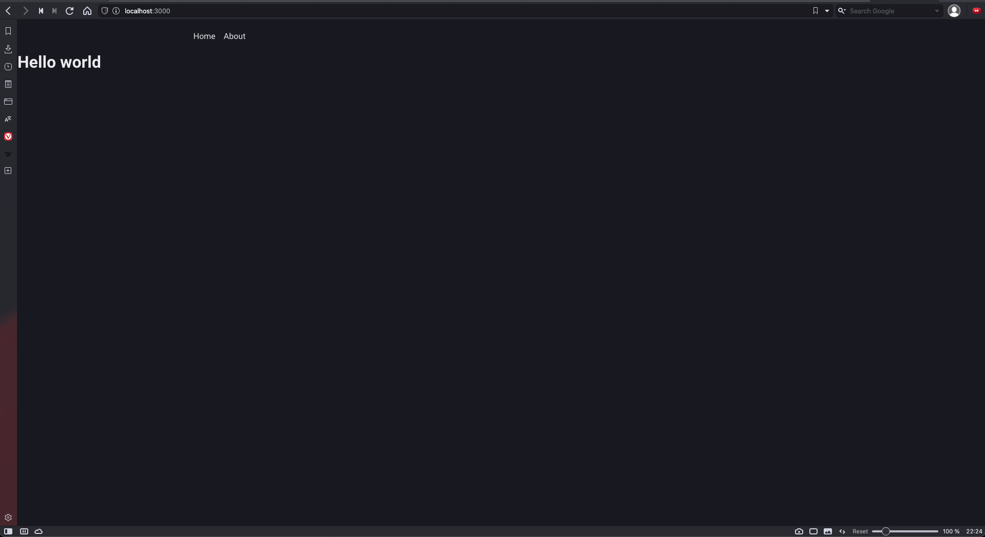
}Now, we can run the project and see the result:
Styled components is amazing and bring lot's advantage to simplify our html file and bring the style complex logic to style.ts file and help you to keep your code organized and clean.